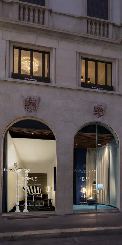
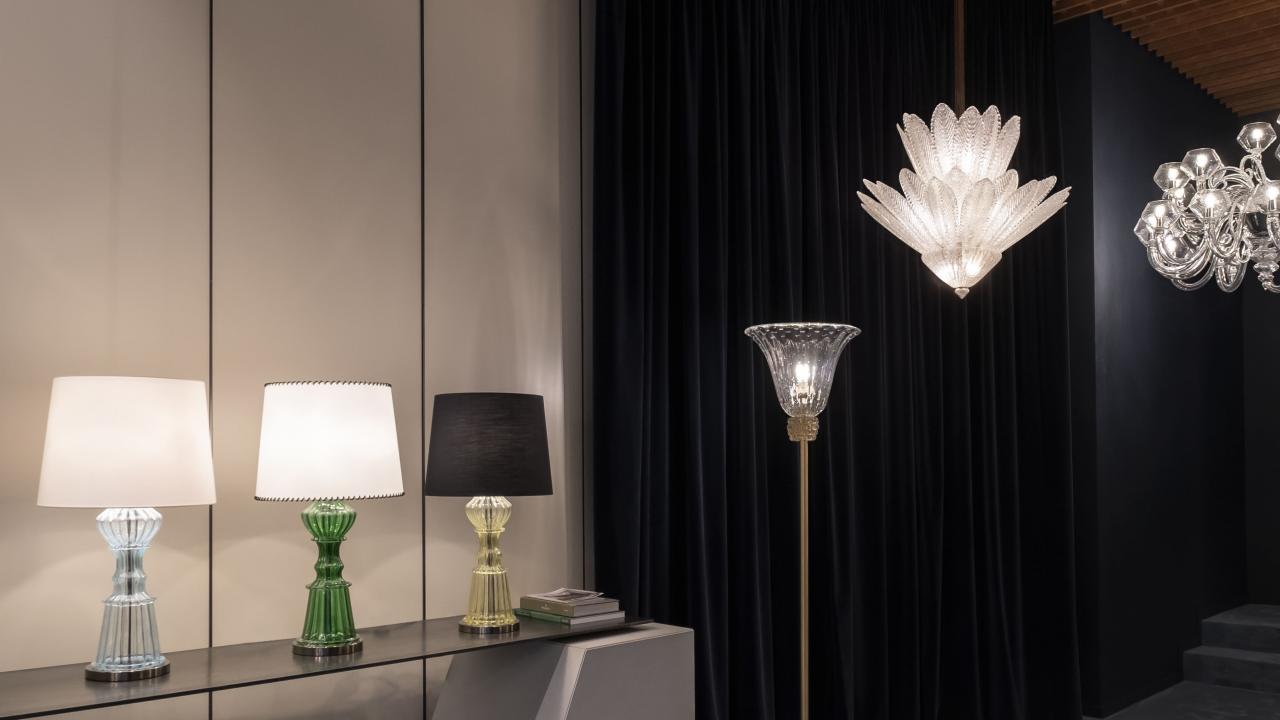
Five hundred square metres, seven windows on the first floor and two display windows facing Via Durini, in the midst of the Design District. The Barovier&Toso Milan showroom stands out for its exhibition and expressive capacity, interpreted by vandersandestudio.
Projects of this type represent a major investment for the company, with a significant return in terms of image, as well as commercial impact. Research, experimentation, collaborations with internationally acclaimed designers… the success of Barovier&Toso is based on all these factors. But one of the strong points that has accelerated growth has been precisely this strategy orientated towards the creation of a single-brand network at the highest levels. This makes it possible to narrate the brand, its products, its vision in an authentic, dynamic way, without mediation and through continuing initiatives and efforts. It also means offering architects and interior designers qualified suppor t and direct services of co-design.
Recognizability, elegance, tradition: the external layout speaks of Barovier&Toso right from the street. The black iron flowerboxes, with a contrasting white logo, link back to the colours of the brand’s identity, running along all the windows of the façade. On the protruding keystones over the two windows, the company’s emblem has been crafted in laser-cut iron, heat-coated in vivid red.
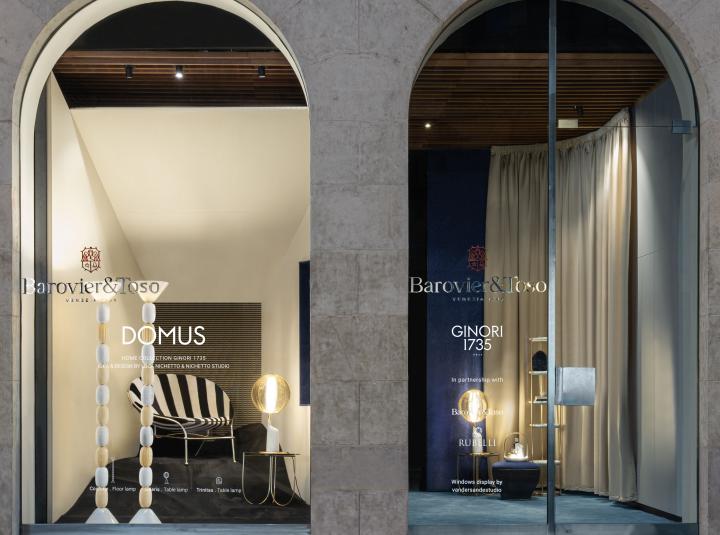
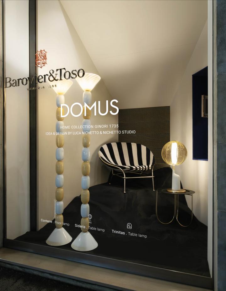
The new windows display, designed by vandersandestudio, are dedicated to DOMUS, the Ginori 1735 home collection conceived and designed by Luca Nichetto & Nichetto Studio.
The left window is characterized by an architecture with simple shapes, expertly placed in space, capable of designing apparently immobile and crystallized domestic spaces, placed in a constant unstable balance, through the unconventional use of light, perspective and proportional relationships among the objects on display.
The window on the right instead reflects on the dichotomy between real space and the representation of stylized, iconic and allegorical objects that hold together a suspended and dreamlike space.
The ground floor showroom
On the ground level, the structure has remained substantially the same. The volumes, however, have been reorganized, with a different configuration of dividers and curtains. Making the space easy to transform was one of the priorities of the restyling carried out two years ago, in September 2020. The pursuit of flexibility prompted vandersandestudio to design a wooden structure attached to the perimeter walls and the ceiling, as a support for movable partitions, curtains and panels.
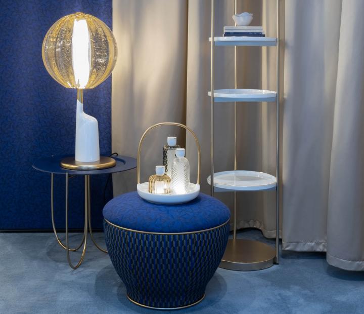
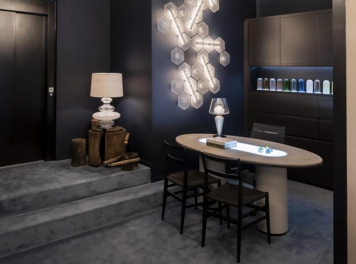
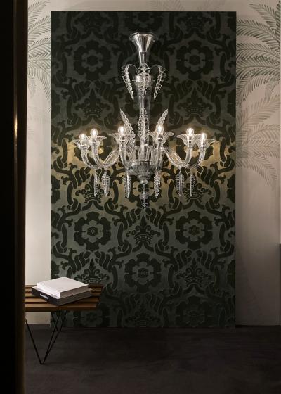
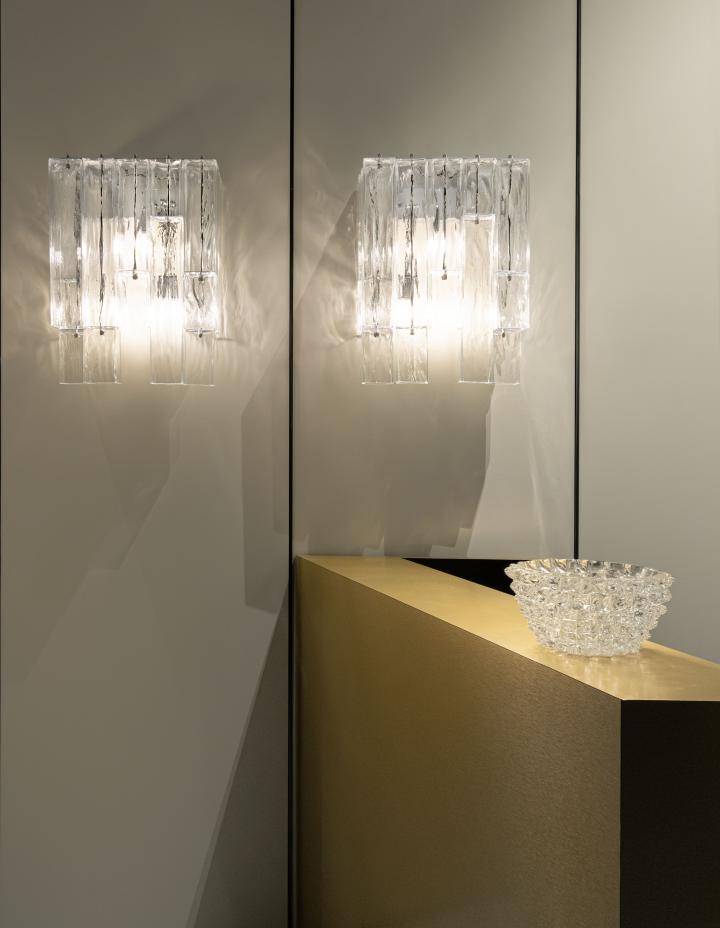
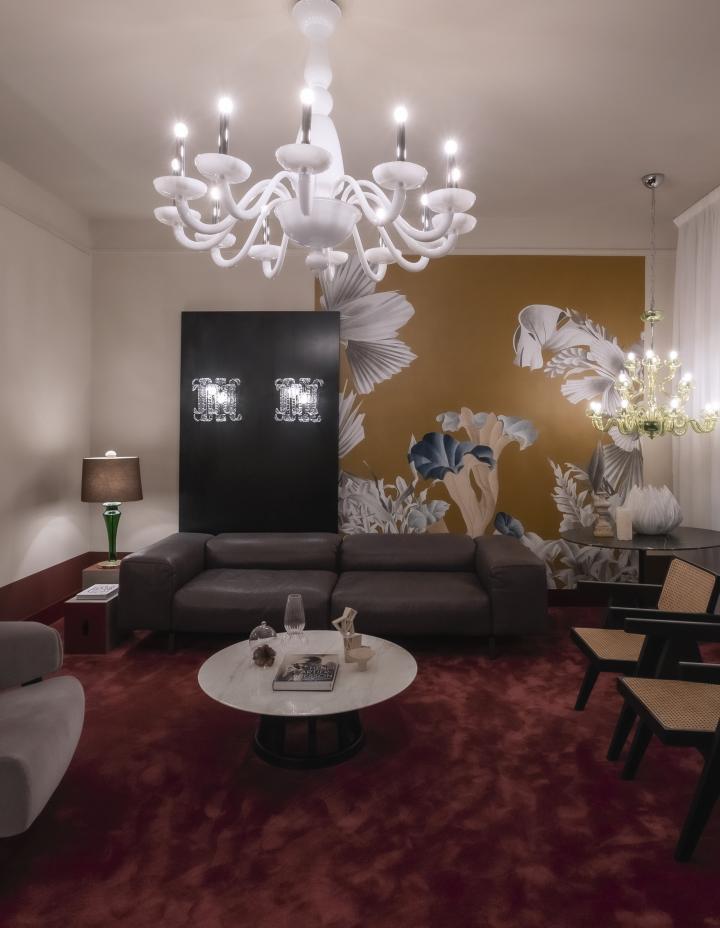
The new layout extends from a reception area to a living zone and a space set aside for consulting. The colours that set the tone of the interiors are the blue of the carpeting and the velvet drapes, the cream colour of the panels in satin-finish enamel, the brass and wood of the suspended ceiling. Custom furnishings in concrete and metal are combined with items by Cassina, generating sophisticated, glamorous atmospheres. The great classics like the Camparino table lamp, in the new wireless version, are joined by the latest collections such as Clepsydra and Magritte, in a spectacular chandelier version with 36 lights.
The Concept Flat on the first floor
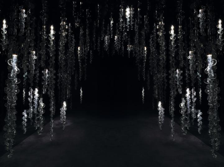
After reaching the first floor by lift, visitors are welcomed by an evocative installation in Venetian Crystal, specifically designed and crafted for the space. A cascade of luminous reeds descend from the ceiling, at different heights, forming a botanical motif. These are the so-called “germogli” taken from drawings held in the historical archives of Barovier&Toso, dating back to the 1920s. The darkness of the room amplifies the luminous effect and lighting scenarios produced by the installation when visitors pass, interacting with their movement. Two completely reflecting counter-walls in fumé glass generate refraction that infinitely multiples the single parts, giving rise to a dense pattern of light and crystal.
The considerably larger first floor has very special display characteristics, making it possible to create a context for the products inside a welcoming, intimate atmosphere that is also lively and dynamic. In structural and stylistic terms, the design configures the space like an apartment, with two long corridors leading to the various rooms. All the spaces are punctuated by the creations of Barovier&Toso: classic and contemporary catalogue items, offering a vast overview of the production, joined by individual custom pieces and three large site-specific installations. The displays continue in the functional operative zones: three managerial offices, two large meeting rooms and two offices of marketing and communication, all with windows. The presence of natural light enhances the settings, putting the accent on the forceful decorative character of the works of Barovier&Toso, which become vivid presences even when the light is off.
The curtains, ceilings and walls are in neutral, luminous colours like beige. Only a few areas are marked by stronger hues, such as the new restrooms in Bordeaux resin, the same shade utilized for the carpeting of the new meeting room. The placement of the installations has been formulated to accompany the entire path of the visitors inside the showroom, with an effect of amazement. The protagonist of the first corridor is Palmette, in an original custom version full of charm. Facing each other, two halfcolumns dressed for a gala occasion exhibit a raiment of woven crystal plumage. Delicate, refined, made one by one, they form luminous frills fluttering upward, with a hint high fashion and Deco style, combining lightness and preciousness.
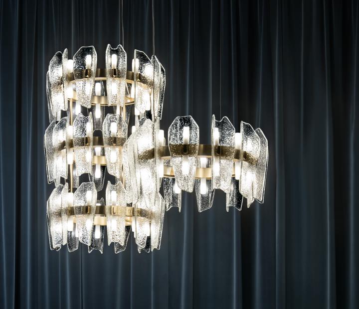
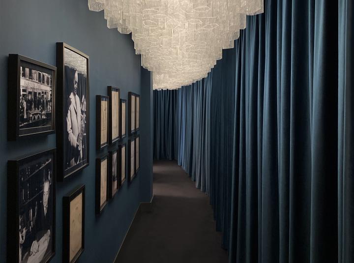
The second corridor hosts an extraordinary installation, a sculptural combination of modules from the Trim collection, with a length of about twelve linear metres. Here the sequence is more irregular and staggered, in a rhythm that captures the gaze. Clear and squared, the individual pieces suspended from the ceiling feature the ice effect, which differs from part to part. Precise and forcefully three-dimensional, the hexagonal geometry of the reeds magically loses its sharp edges and rigor, forming a vaporous, genteel setting, like a luxurious tulle cloak. The technological factor is also thrilling and surprising, permitting the entire composition to act as a single system capable of activating various luminous scenarios.
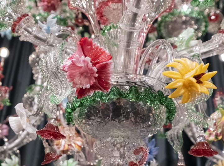
The creation of a personalized technical lighting project that covers all the decorative, functional and emotional aspects requires experience and expertise, and it becomes even more complex in relation to specific and eclectic requests. Barovier&Toso is able to interpret the term “personalization” at the highest levels, reaching the point of formulating entirely bespoke products, crafted by hand, and interactive scenarios developed to order, as fully illustrated by the remarkable displays in this showroom.
Once again, Barovier&Toso has decided to invest in creativity and synergies with outstanding professionals and brands. Beauty, history and design are the driving forces of the new showroom, resulting in a dynamic vision that looks far into the future.
Milan Showroom & Concept Flat
Via Durini 5
20122 Milano - Italy