Venetian crystal meets design with poised, evocative lines of a precisely contemporary character.
The elegant, refined matching with metal parts and the new colour palette are highlighted in the displays created for the FuoriSalone in Milan by vandersandestudio.

5-10 September 2021 | Milan returns to its central place on the international design scene. Barovier&Toso is proud to take part in this special edition of the FuoriSalone, an event welcomed with great enthusiasm on a global level.
For the occasion, the company presents two new collections of chandeliers, VERTIGO and METROPOLIS, and a novel colour palette. These are the new developments featured in an exclusive installation by Barovier&Toso curated by vandersandestudio, showcased in the windows of the showroom on Via Durini.
The new collections
The new offerings of Barovier&Toso take their cue from the glamorous, seductive atmospheres of the 1920s, drawing on the lively ferment in the visual arts, design, architecture, and fashion in that period. Referencing the vibrant aesthetic trends that made New York, Moscow, Berlin, and Paris into worldwide capitals of luxury, entertainment, and lifestyle, Barovier&Toso launches two fascinating, refined new collections charged with intense, sensual expressive energy.
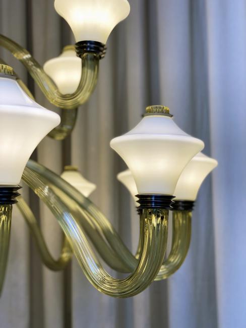
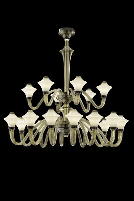
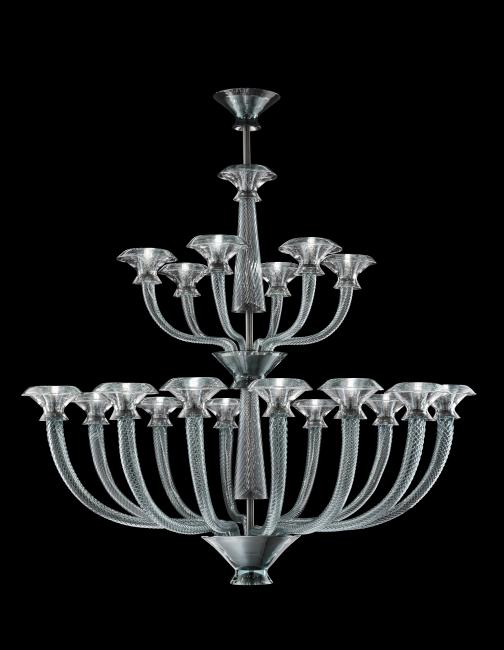
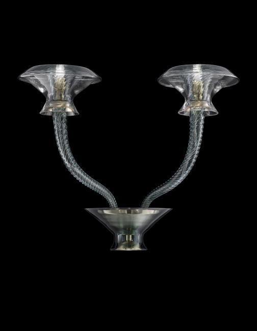
Metropolis is a collection that forcefully evokes the class, symmetrical and plastic forms of Art Deco, shaped by a harmonious, fluid rhythm. The chandelier version has a central body in the form of a chalice, from which arms extend, crafted by hand in blown Venetian crystal. The pieces stand out for their sturdy diameter, softened by the external ribbing with its longitudinal arrangement. The sinuous arms curve and reach outward, sliding down at first and then opening upward.
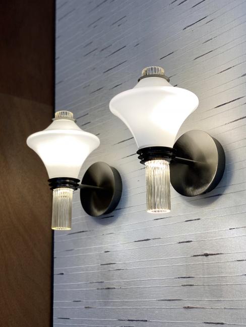
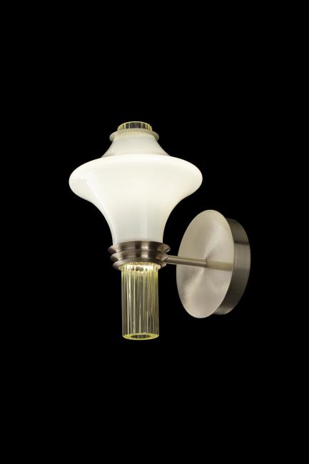
The light source is concealed inside the cups in opaline glass, embraced at the two ends by metal collars. The mouldings, proportions and the entire construction of these terminal parts suggest the upper structure of classical columns topped by capitals. This particular character and intense dialogue between materials is even more vivid in the elegant, essential wall model, with its own design and measurements.
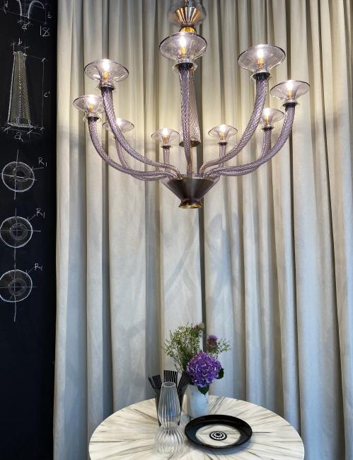
Vertigo is a family of chandeliers and wall sconces that thrives on contrasts, combining dynamism and symmetry, delicacy, and power. Its original vertical thrust is attenuated by the radial extension of the arms, softly opening like petals. The main decorative feature, which gives the collection its name, is the spiral motif that wraps the arms and opens in the uppermost part, accentuating its shape.
Completely crafted by hand, it reveals the great skill of the glassmaker to create a very complex, detailed yet perfectly regular arrangement of curves. The light source, wrapped by this painstakingly decorated chalice, is also enclosed by another cup that flares upward. The central body reprises the paced alternation of oblong and flared forms, with different proportions. At the same time, it displays the continuous interpenetration of Venetian crystal and metal, for both structural and decorative purposes. The result is a rigorous aesthetic of forceful, seductive character, pervaded by sophisticated grace.
The new palette
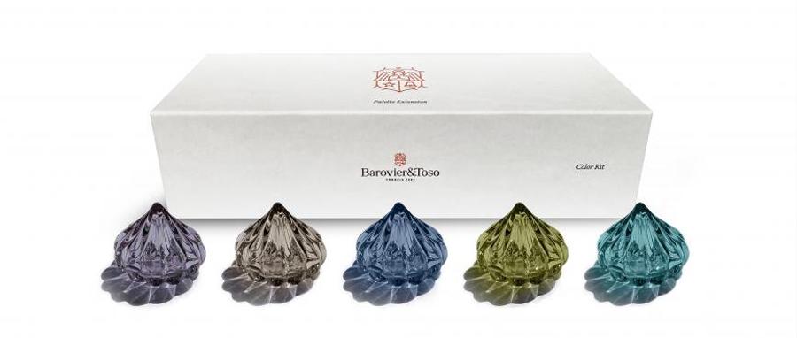
The already wide, varied range of colours of Venetian crystal by Barovier&Toso now includes new hues created to respond to the latest trends in interior design.
The modern, stylish tones of the new palette are lively but also have low saturation levels, to generate a soft, refined effect. From the delicacy of sand to the vibrancy of olive, by way of magnetic, intriguing periwinkle and cadet blue, and then indigo with its intense, enveloping shades of skies at twilight: new nuances to generate new aesthetic and emotional possibilities.
Colour has always been a key factor in the company’s history: just consider the constant experimentation conducted by Barovier&Toso across the centuries in pursuit of particular, distinctive hues and chromatic effects. That creative spirit is still very much alive, driven by the desire to offer something novel and unique, year after year. The goal is not only to create amazing products, but also to open up new imaginaries for architecture and interiors, designed with a wide-ranging, coordinated and synergic overall vision. To this end, the colours introduced this year range through warm and cool tones, permitting multiple combinations, daring or more understated and painterly contrasts, for a clearly contemporary image.
The installation designed by vandersandestudio
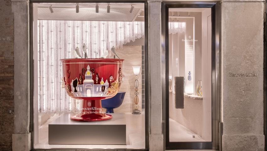
The fertile collaboration between Barovier&Toso and vandersandestudio continues, after the restyling and expansion of the showroom on Via Durini in Milan. For the FuoriSalone, the windows of the single-brand store will feature a preview of the company’s latest creations. The installation takes a dual approach, providing a context for the new products while also offering a glimpse of the world of the glassworks.
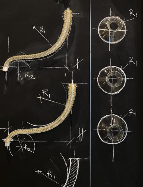
Metamorphosis, fire, red-hot tools, the ability to gauge the energy of the arms, to repeat age-old and extremely refined techniques; the capacity to carry out a design with extraordinary precision... many secrets and skills are hidden behind every creation of Barovier&Toso. Observation of the production process leads to speechless enchantment: a magic vandersandestudio has underscored through a visual element that symbolizes the gestures reiterated inside the glassworks. These are the signs, the arcs, the measurements traced with chalk on metal, as a reference to follow during the course of the glassmaking. The host of this showcase is a chandelier with nine arms from the new Vertigo collection, in the periwinkle version. The juxtaposition with a table in Budri marble is precious and sophisticated, seen against the backdrop of the neutral colours of the curtains by Pierre Frey.
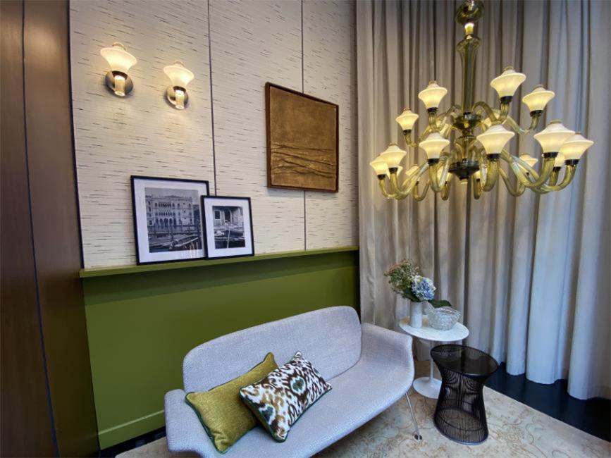
The setting featured in the other window is fresh and light, dominated by an 18-light chandelier on two levels from the new Metropolis collection, in olive green. The elegance with which the arms fill the space with light and colour goes hand in hand with the choice of furnishings by Knoll, gently anchored to the ground. The background panelling echoes the green hue of the chandelier, in contrast with the Metropoliswall sconces in sand-colour crystal, and with the wall in “blanc” covered in paper by Pierre Frey. A shelf forms an ideal borderline between the surfaces, like a horizon that presents images evoking the nostalgic savour of late summer: a mood that interprets and enhances the colours of the new Barovier&Toso palette.
Thanks to:
Amini, Budri, Gianluca Bellomo, Knoll, Marco Solzi, Pierre Frey, Vandersandestudio.
